Making a Wiksten Haori from a Mid-Century Modern Curtain

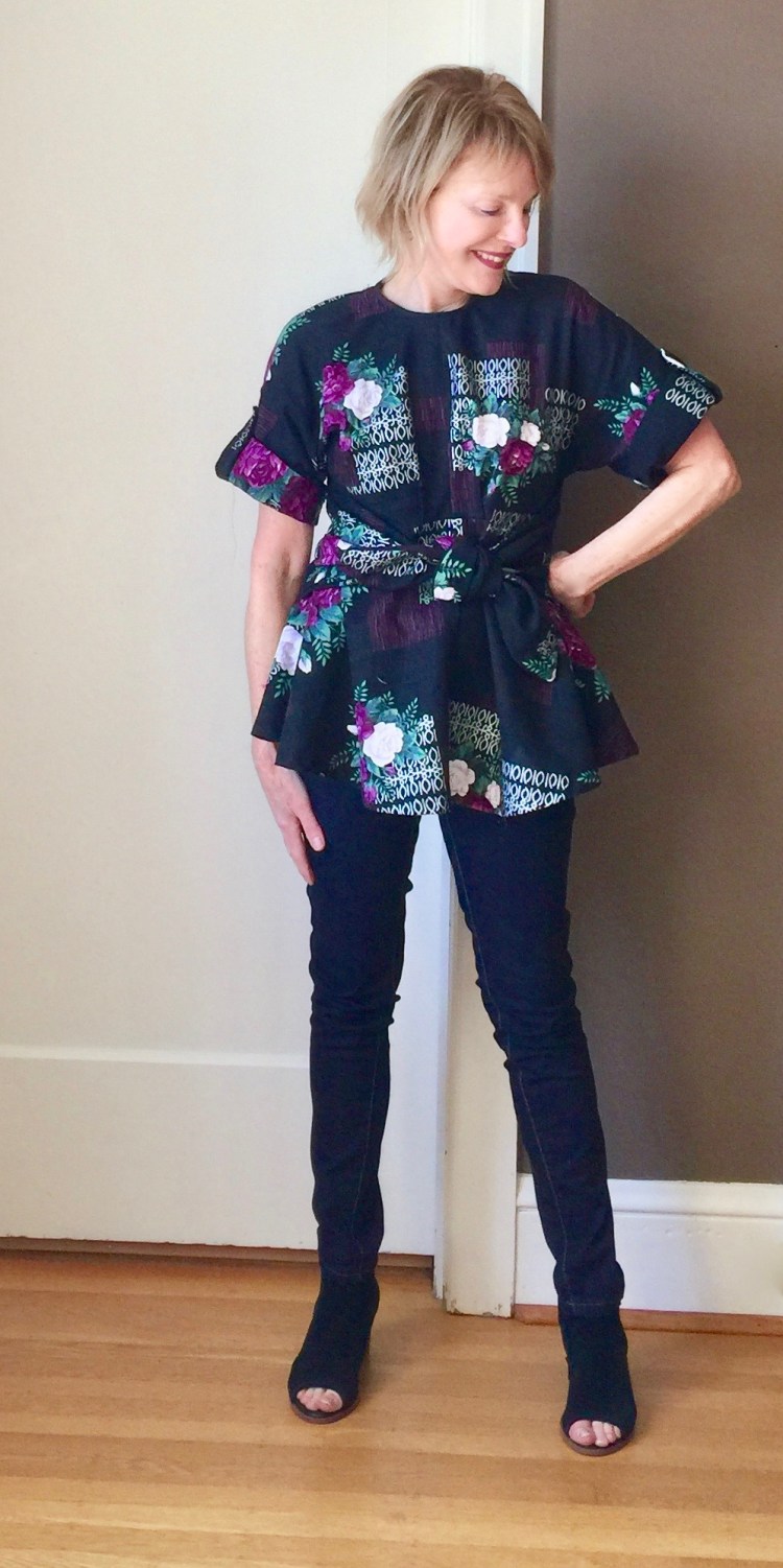
This Wiksten Haori was once a curtain in someone’s house.

IMG_1847.jpegThe leaf design on this fabric is typical of the mid-century modern style. It was all about the exotic, so tropical themes were big. Vintage drapes can cost as much as $200 per panel on Ebay. One Saturday afternoon, I got lucky.  I found mine at a estate sale for $10.

Estate sales can be such a great place to find vintage fabric and notions. My interest in them grew after I participated in the  #tableclothrefashion challenge on Instagram. I made a couple of tops from vintage tablecloths (here and Here) and had so much fun, I started exploring other vintage fabrics as well. I do love taking something old and making it new. Now, I can’t pass by an estate sale without taking a look.

IMG_1743.jpegThere was only one drapery panel at the sale so I didn’t have alot of this fabric to work with. This drape wasn’t lined, which meant it was ready for my project right away. The trickiest part of the make was figuring out how to best place my pattern pieces to let the leaf design take center stage.

This is the second Wiksten Haori I’ve made (first is here) so this make was pretty easy for me. I do love how the pattern is drafted so that the jacket is reversible.

Kimono_Flat_Sketches

IMG_1719.jpegThis is the short verion of the Haori, lined with soft Chambray, the perfect fabric mate for my drapery barkcloth. Although I could reverse my Haori and wear it blue side out, I doubt I will – – I love the barkcloth side too much!

IMG_1820.jpegAs in my other version, this Haori has a lovely feel, in part because the barkcloth is soft but heavy.  That’s one of the reasons I love to wear this one so much. It feels substantial, but not too stiff. In my opinion, a medium weight fabric lined with a sleek lightweight fabric makes the perfect Haori.IMG_1847.jpeg I love the boxy shape of this jacket and the casual feel of the fabric. I know I’ll wear it again and again. Honestly, there’s a reason this is one of the most popular patterns around. It’s so fun to sew and wear. I can’t wait to make another!!  Now, if I could only find more vintage fabric….Sources anyone?

Happy sewing and thanks for stopping by!

Finding Violet and Vogue 9363

IMG_4895I’ve really enjoyed the #sew happy color challenge on Instagram. It’s inspired so many lovely posts by members of our sewing community! The premise of the challenge (created by @katiekortmanart) has been to explore combining complimentary colors in new ways. For me, it’s been an opportunity to look at the colors I love and to think about ways I can have more of them in my wardrobe and life.

This last week of #sewhappycolor features violet and blue. Blue…well, you all know how much I love that color (LOL). My wardrobe includes so many blue options, I could wear the color every day if I wanted. I love violet too, but my stash of fabric and wardrobe doesn’t really reflect that at all.

IMG_4849

So I took a trip to the fabric store, intending to buy a beautiful piece of violet fabric. Instead, I ended up with a print. It’s the scale of this one that caught my eye. The areas of solid black provide negative space that really allows the large violet flowers to pop. I really love this print….Hmmm, need/want more like this…

IMG_4980

Vogue 9363 is my pattern, new this Spring. I can’t resist a pattern with a front tie!  (see my other tie makes here, here and here)

Construction: Although the fabric recommendations include rayon and crepe (lots of drape), I chose Japanese cotton because I wanted the top to look more structured. It was such a such a dream to work with. It shapes beautifully and is a joy to press. The pattern is well drafted too. I cut my usual size and have absolutely no complaints about the fit. The curve of the front bodice seam gives it a unique drape, and the sleeves are easy as they are cut as part of the front and back bodice. There’s a zipper in the back and the loose fit is shaped by front and back bodice darts as well as the wide belt. It’s an easy top to fit and wear.

Changes modifications: I made the short sleeve version of the top/tunic. The pattern suggests the sleeves be finished with a machine hem, but since the print has a bit of a vintage vibe to it, I decided to add a rolled cuff to the sleeve with a buttoned sleeve tab. I really like the finished look of the rolled cuff on this generous sleeve.

IMG_4981

This lovely print has reinforced my love for violet. I’m hoping there will be more of this happy color in my future. For more inspiration and information about complimentary colors, check out Katie’s blog…it’s a wealth of information very enthusiastically presented. #Sewhappycolor was such brilliant idea – – Thanks Katie! Have you all enjoyed #sewhappycolor too? Any new revelations?

Happy sewing and thanks for stopping by!

A Vogue Vintage Jacket in Plaid

IMG_9618 2 
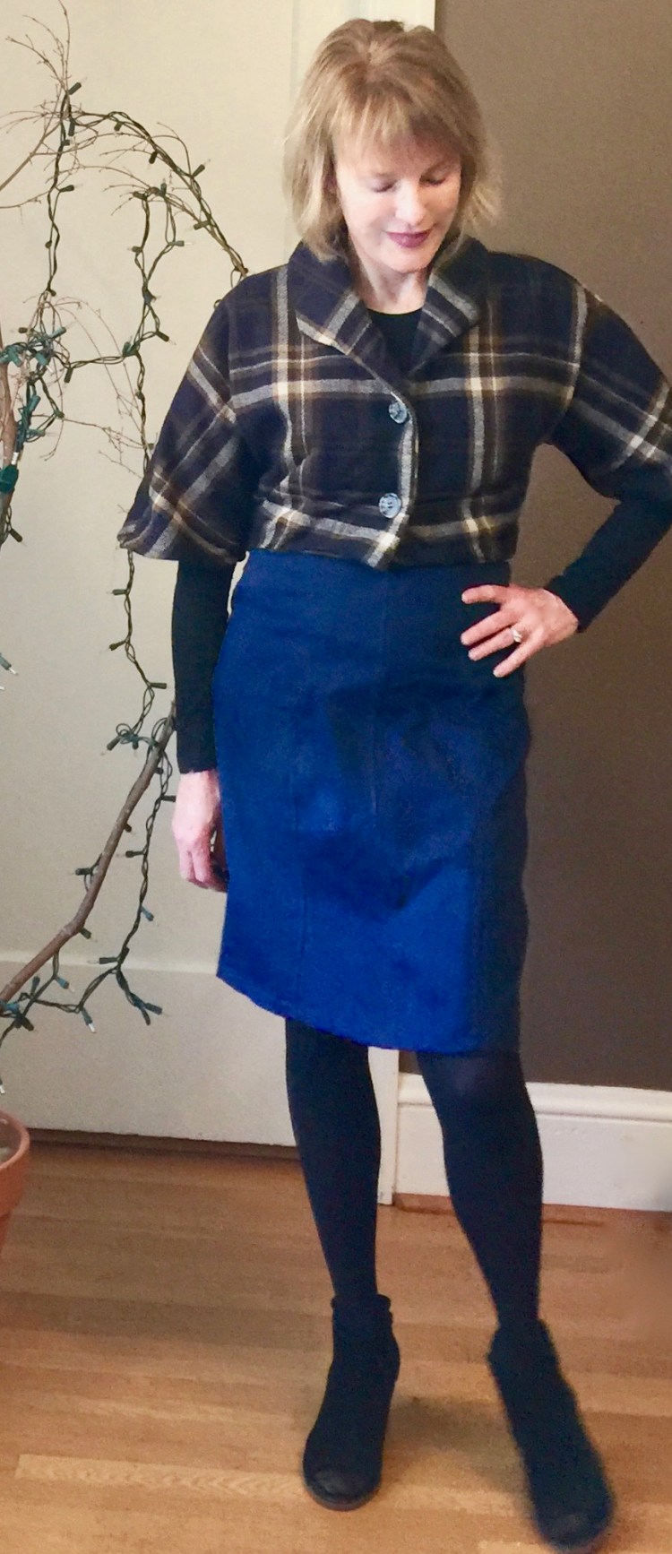
Hi all! I’m back from a bit of a holiday break with a plaid jacket, inspired by one I saw in Vogue pattern Magazine. If you’re like me, you look forward to each issue of the Vogue Pattern magazine because there is always something there that will spark an idea for a project. This issue was one of my favorites as it was all about PLAID.

vpm_product_0

Love the plaid coat on the cover!! Inside, a vintage Vogue jacket caught my eye, and I knew I’d have to make my own version.

IMG_9631


It’s hard not to love a good Vintage Vogue design! Vogue 9082 is especially appealing because it has a cute cropped jacket.


I made my jacket from a plaid I found at the Mill End Store here in Portland on my usual Fall visit there. I’m always on the lookout for classic but fun plaids, and, as usual, they did not disappoint. This fabric is really lovely in person; photos don’t do it justice. It has a bit of olive green and gold in it, and it’s so soft, a blend of wool and acrylic. I was lucky enough to get the last two yards on the bolt.

IMG_9598 2


Challenges: The pattern is pretty straightforward and pretty easy, but hey, I had to complicate things by making mine from plaid. It was a bit of a challenge to lay the pattern out because the sleeves are cut as part of the bodice. This means you must be sure that you place the plaid on the bodice carefully because that line follows down the sleeve. The good news is…because you don’t set in the sleeve, it means you get to avoid the whole sleeve to bodice matching ordeal, The bad news…the wrong placement could mean you’d have plaid sitting awkwardly on your shoulder. My plaid was large so a mistake would be glaring but I think it worked out well. By the way, my success rate with matching plaid has increased considerably since I started using Wonder Clips to hold things in place while cutting and sewing. s-l640

I love these things so much! Just posting a photo of them makes me want to buy a zillion more. You can find them at Joann’s, at craft stores, on Amazon. They are so useful and all the colors….I could go on and on!!

More about the challenges – – those collar points!!  From the line diagram, it appears that the collar is designed to look a bit more angular and pointed than in my version. Not sure why, but mine aren’t quite as dramatic as I expected. I think the error happened when I cut the bodice. When I inspected the pattern pieces later, to my surprise, I’d cut the collar points as I expected them to be, rather than how they were. Perhaps it was because I was binge watching Outlander. Blame it on Clare and Jamie.

IMG_9602 2


I think the cropped style works best with my highwaisted denim skirt (made here). It would probably work with jeans too!

Future posts and plans….

The holiday season is in full swing around here. It’s my favorite time of year because I get to sing in several Christmas concerts with my choir, which is such a privilege and joy. It also means I’ll be sewing a few fun EASY gifts for friends…Curious if you are too?  My next post will probably be about that. In other news, the year is coming to an end, as is the 2018 RTW fast and I’ve been thinking alot about that experience and what it’s meant to my sewing journey so I’ll share those thoughts too. Then, of course there will be a hits and misses post for 2018. So much to talk about!

I hope you had a nice holiday with family and friends. Happy sewing and thanks for stopping by!


A Textured Knit Cardigan For Spring


IMG_7399 3When I saw this textured knit last winter at Britex, it was love at first sight. I was so taken with the open weave, the natural color, the texture that was remiscent of eyelash knit, that I didn’t bother to check how much stretch it had, or to think about what I might sew with it. I just bought it!

IMG_7384 3


When it was time to sew, I was pretty surprised to discover my lovely knit had absolutely no stretch at all. Ha, that will teach me. My gut told me it was perfect for a cardigan, but most patterns require two-way stretch. I did find one in my stash though that was more like a jacket than a sweater, a style that would be compatible with a stable knit.

McCalls 6708 is an out-of-print pattern I’ve used before here. I love the Chanel Jacket look, and the structure the front and neck bands add. I think you could get a similar look using a collar-less jacket pattern, adding patch pockets and front bands.

IMG_7349


Challenges: This pattern required inserting buttonholes into a very loosely woven knit. I tried a few with remnants of the fabric and discovered my machine just wanted to eat it. So I fused little pieces of interfacing to the back of the band to put a protective layer between feeddogs and fabric. The buttonholes were a success, but this changed this project from easy to requires patience.

This knit, even though stable, has a tendency to stretch, a less than ideal characteristic when it comes to patch pockets. So, to help the pockets keep their shape, I interfaced the entire pocket. Because the fabric unravel easily, I serged the seams.

IMG_7446 2

I think it looks a little bit retro, don’t you? This sweater will be perfect for Spring. Even though this knit wasn’t ideal for this project, I do love how it turned out and I’m so glad it came home with me! Have you started your Spring sewing?

In other sewing news, I’ve started my night dress for the Day and Night Dress challenge. I can’t wait to show it to you. I’m also gathering fabric and patterns to participate in the Pattern Review Wardrobe Challenge. I’m not sure I’ll be able to get them all sewn before the deadline, but I’m going to have fun trying. It’s stripe month over on the Sewcialists too…so much inspiration right now in our community!

Happy sewing and thanks for stopping by!


A Sparkle Tweed Coat for Spring


img_2982-2I didn’t know I was a fan of sparkle tweed until I saw this Kate Spade coat. njmu7301-black-d7d16d49

In person, this tweed is gorgeous, and when I saw the coat at Saks I became a serious fan. I love how Kate Spade designs clothes that feel vintage yet fresh. And those shoes…!!

img_3014The photo above shows my coat buttoned up all the way like the  Kate Spade version, but I think I like it unbuttoned better.

img_2988-2

I found my sparkle tweed at Mill End Store last fall. It’s a wool blend that’s warm but lightweight enough for Spring, perfect for my Kate Spade knock off. The pattern I used is Butterick 5468, an older fast and easy pattern that could be a good starting point if you’ve never made a coat before. It isn’t in print anymore, but it’s available on Etsy and Ebay. It’s such a basic style, you could probably substitute B6107 or B6385 and get the same look.

5468

I love the in-seam pockets on the longer versions of this coat.

img_2931

I modified the pattern by lengthening the sleeves to full length. The Kate Spade sleeves are 3/4 length which is really cute, but less than practical in blustery Oregon. I also fully lined the coat, even though the pattern doesn’t call for it. I added a double faced tie at the waist too.

It’s an easy pattern, without alot of bells and whistles which is perfect for highlighting a special fabric like mine. As usual, the biggest challenge was the plaid matching. Grrr. I had to cut the sleeves twice to get them right. Fortunately, I had extra fabric, a rarity for me!

img_2999

I like the fact that this coat looks manish and boxy without a belt but more feminine and retro with one. Two looks from one pattern, Yay!

img_2935

img_2951What do you think, belted and girlish or unbelted and mannish? The Kate Spade version is a little fuller below the waist, I think, and the shorter sleeves have a bit more of a bell shape. Next time??? I think my version is close enough to enjoy, and reasonably priced as well (LOL).

In spite of the fact that it’s cold here, with the threat of snow in the forecast, I am happily transitioning into Spring sewing. I’ve organized my stash of linen and cotton and will be working on those sorts of projects going forward.  Out with the wools, in with the linens!! Have you transitioned into Spring?

Happy sewing and thanks for stopping by!


Kimono sleeves or bell sleeves? That is the question!

DSC02859

For months, I was sure the sleeves on this top were called ‘kimono sleeves’ until I was corrected by a clerk in a local fabric store. “No,” she insisted. “Those are NOT kimono sleeves. Kimono sleeves are cut as part of the bodice. Those are definitely bell sleeves.”

Really? I was doubtful. But, well, yes. According to the Craftsy website, she was 100% correct. Bell sleeves are are always narrow at the shoulder, wide at the bottom and they are never cut as part of the bodice. Live and learn.
For me, the Bell sleeves are the major attraction of this otherwise simple top.
DSC02857
I fell in love with those fun sleeves all over again this Spring, when I noticed them in the Chanel resort collection.
_L1R0465.1366x2048
And this is by Oscar de la Renta….
zara-2-1
 I’ve been a bit obsessed ever since for reasons I can’t explain. Perhaps, it’s because they’re a bit retro?
227278-A15679
Or is because they’re so comfortable? Who knows?
I used Butterick 6175 for my bell sleeved top, a semi fitted pullover top with sleeve variations.
B6175B6175 (2)
Since the top has a very simple design, it seemed to be the perfect opportunity to use a not-so-simple fabric. So, I chose a Japanese border print I had in my stash. It has a large floral design as the main motif, with a contrasting (but subtle) checkered print as the border. I cut  the bodice from the flowered motif and the sleeves from the checkered border.
 IMG_1115
The tricky part was laying the pattern out in a way that captured the directional focus of the floral print. Because the pattern’s ‘repeat’ is widely spaced, it was a bit tricky, since I’d purchased a (very) scant yard and a quarter (when will I learn to buy a little extra to be on the safe side?). I also wanted some pattern at the neck for interest.
After struggling for well over an hour to get it right, I decided, I’d had enough torture for one day. So, I simplified things and made the liberating decision to cut the sleeves from the contrasting border print, which didn’t have a pattern repeat to contend with.
DSC02855
 I made one slight variation to the pattern. I skipped the back neck line slit, as I am not a fan of that look and used a short zipper in the back instead.
DSC02860
The construction of the top was easy. But do I like the finished product? Hmmmm.  I’m not altogether sure. In hindsight, a boxy, cropped top probably isn’t the best choice for a short-waisted girl like me.  But I do like the fabric, so I’ll probably wear this top, anyway. I guess I could always add a couple of eyelash darts to the back to give it a bit more shape (?). Regardless, the project was worth the effort as I learned a lot from the challenges posed by choosing a fabric that has a one way print with a repeating pattern. Next time (if there is a next time) I vow to buy way more fabric than I think I need!!  And, I do love those sleeves!
How do you modify patterns to make them less boxy? Or do you just skip the look? Thanks for stopping by!

A Spring Coat like Betty’s

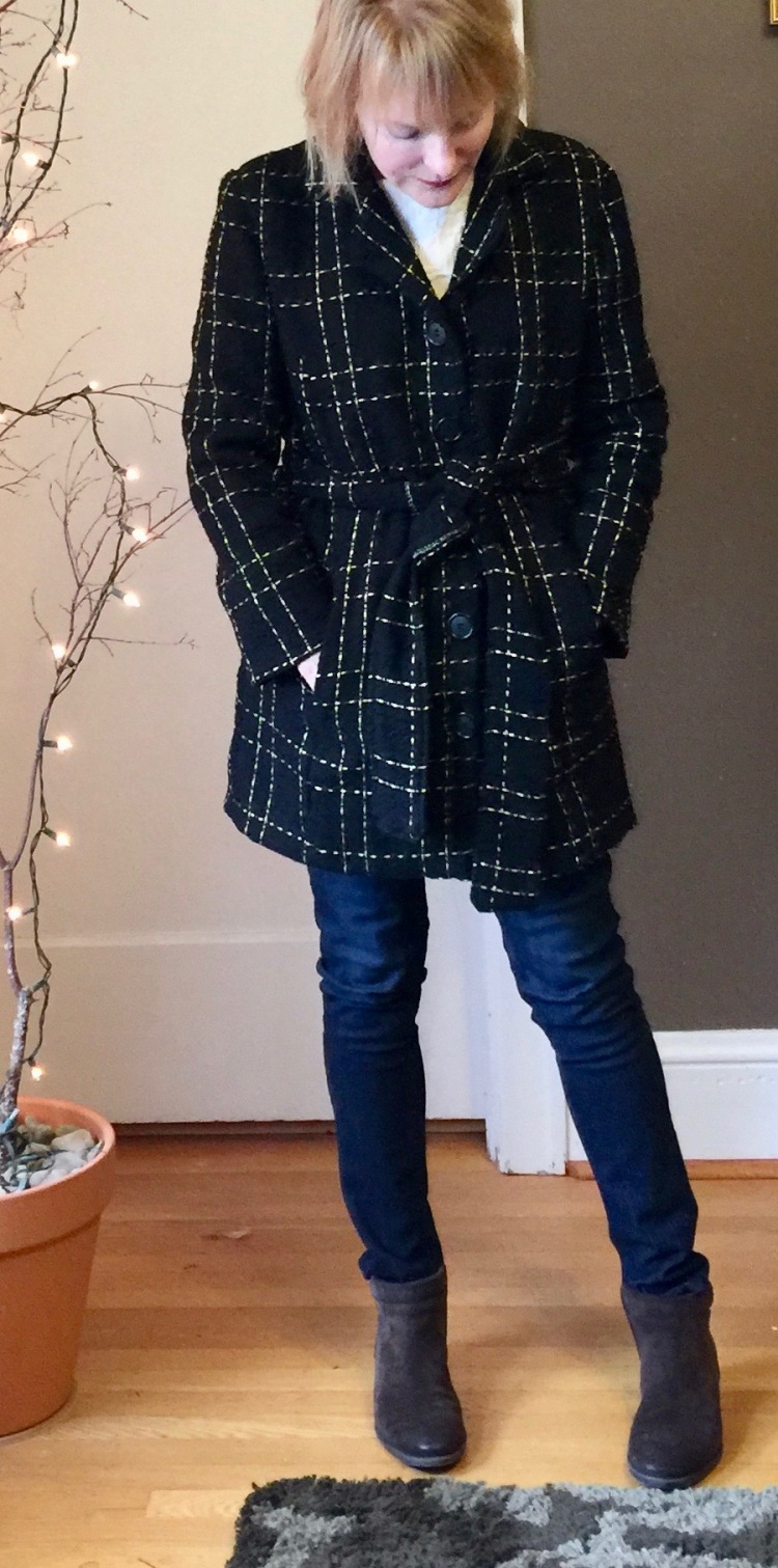
Betty Draper was my inspiration for this coat. Do you all remember the blue coat she wore in season one, when she was still in love with Don?
betty1bluecoat-web
A statement coat to be sure! And look at her hair, how it curls under so perfectly! No wonder Don had to have her.
I made my version of her coat from a Butterick pattern from my own extensive (!!) archives. It’s Butterick 5569, a coat pattern designed by The Cut Line that has princess seams and a big collar that gives the style a retro feel.
DSC02471
The fabric is from Mill End, an incredible fabric store here in Portland that has a wool department that beats all. My coat is made from a thick, double-faced wool in black, dotted with flecks of white.
To sharpen the details, I trimmed the coat’s front lapel and collar with piping, then finished it with vintage buttons I found in Stars Antique Mall in Portland.
DSC02483
Because the wool is double-faced, it’s very heavy, so I didn’t want to line the coat because I thought it would be too hot to wear. So, I finished the seams with binding so that they wouldn’t fray, giving the inside of the coat a finished look.
The coat’s comfortable and warm. I even braved the elements and wore it when I visited Anthropologie last week (okay, true confession. I do not make everything I wear, LOL), and I did not feel out of place in my me-made garment, which makes it a win, right?
DSC02481
Soon, it will be so warm here in Portland, I won’t want to wear this coat (says the optimist).  But right now, Summer feels years away, so coats are a must.
DSC02686
I love retro fashion, but prefer to sew from modern patterns with their fabulous fit. What about you? Have you used vintage patterns? Good experience or bad?